🚗 Look for inequities in parking tickets
Challenge
An elected City partner asked the Comptroller’s office look into patterns of inequity on where the City wrote parking tickets. Were certain disadvantaged neighborhoods particularly targeted by ticketing?
Data and analysis
For a relatively straightforward question, preparing the data and structuring the analysis were no small feat.
Geocoding
The City’s Department of Revenue publishes on NYC Open Data records of all parking tickets—some 12 million per year—but these records are not geolocated to a point on the map. So the first step for any geographic analysis was to convert locations that could look like:
| Violation County | House Number | Street Name | Intersecting Street |
|---|---|---|---|
| NY | W 28TH ST | CHELSEA PK | |
| NY | 436 | 27TH DR | |
| Q | B 97 ST | SHORE FT PKWY | |
| K | 60 | FURMAN ST |
to actual mappable locations.
I used the the City's Geosupport tool, a custom (and finicky) geocoder for New York City addresses, to locate these tickets.
The Department of City Planning-maintained Geosupport is a powerful tool, but also somewhat klunky to use and exacting in its needs.
On the plus side, it knows how to handle quirky New York City addresses, like Queens house numbers with dashes in the middle, or repeated street names. And, in addition to latitude/longitude point locations, it returns local administrative geographies, like Community District, Census Tract, Police precinct, and street segment code, and projected X/Y point locations.
Instead of a catch-all search bar like that on Google Maps (or geocoder tools like ESRI’s or HERE’s), Geosupport is based on structured searches for particular location types, e.g. intersections or property lots or house number-street name addresses.
Geosupport takes these structured queries for addresses or locations and returns only exact matches; it doesn’t interpolate addresses or guess at similar names (it can return ‘similar’ street names, but this seemed fairly worthless in practice). For an analytic purpose like this one, this can be an advantage: I lose some data that is not geocoded, but I can be confidant that the records I do have are where they say they are.
Geosupport functions as low-level software. It does have a truly vintage looking desktop interface, but that only handles searches one at a time. Fortunately, there are Python (and other) bindings to the search to pass data through the Geosupport tool and extract results.
Geosupport has voluminous documentation but little instruction on how to actually use it. So I had to work out a lot of this, but many thanks to DCP for this guide.
Actually running addresses through Geosupport, especially 50 million or so records, took some data engineering.
I used the python-geosupport binding to include the search within a Python data pipeline. I needed to do lots of up-front data cleaning to get addresses Geosupport would recognize. Then I built scripts to send addresses through either the house number-street address search or street name-other street name intersection search, depending on what information was available.
Once I had a working pipeline, I had to scale it up by parallelizing the search (which is surprisingly computationally intensive) and managing memory to run the whole thing on my City-issued computer. So a few overnights later, I had point locations and relevant neighborhoods and Census Tracts for the 80 percent or so of the tickets that could be located.
Finally, I joined together the geographic locations, original ticket data, loaded everything into a sqlite database, and then I had something to work with.
Building proxy measures: estimating ticket risk
The analysis question was, essentially, about which New Yorkers are targeted for parking tickets. This was not information we had. (Though I took some ultimately fruitless steps to try to get vehicle registration addresses to match with license plate data). Instead I had where tickets were issued. This is an imperfect proxy but I tried to make it a better measure by:
- filtering to tickets issued to New York State-registered vehicles;
- filtering to tickets issued not on commercials streets (that is, spatially filtering to exclude tickets on streets within or adjacent to commercial or commercial overlay zoning)
- removing certain categories of tickets that would not effect residents (e.g. missing bus permit)
- normalizing the number of tickets in each tract by the number of households with one or more vehicle. This normalized rate I considered to be parking ticket risk.
Analysis: No overall racial or income inequity, but particular neighborhoods with greater compound risk
I looked for patterns of inequity in a variety of ways. I began by looking for relationships between racial demographics of each Census Tract and the parking ticket risk. I found no overall or comprehensive relationship between any measure of racial composition and ticket risk. But exploring geographically, I found that this is because there are some areas with predominantly Black and/or Latinx/Hispanic residents that have higher ticket risk, but also some such neighborhoods with low ticket risk. While race alone does not explain the variability in ticketing, this analysis did pick out certain communities of color that do have increased ticketing.
I also considered income and looked for relationships between an area’s median income or portion of residents who are poor or lower income and ticketing risk. This, again, yielded no overall, citywide pattern.
Additionally, I looked at median income or poverty status specifically of drivers, to better model specifically where higher ticketing risk might ensnare lower-income residents who depend on a car to get to work. I found a signs of a relationship here, where areas where a higher portion of drivers-to-work were lower income also had a higher ticketing risk. However, checking further to try to confirm this finding I found that the high margins of error on this narrow crosstab cut of Census ACS data were so large that they swamped whatever illusory effect I initially found.
Moreover, the few hotspots where perhaps lower-income drivers were feeling an extra burden from ticketing were also relatively well-served by the subway, making it less likely that residents in these areas had to drive.
Data visualization
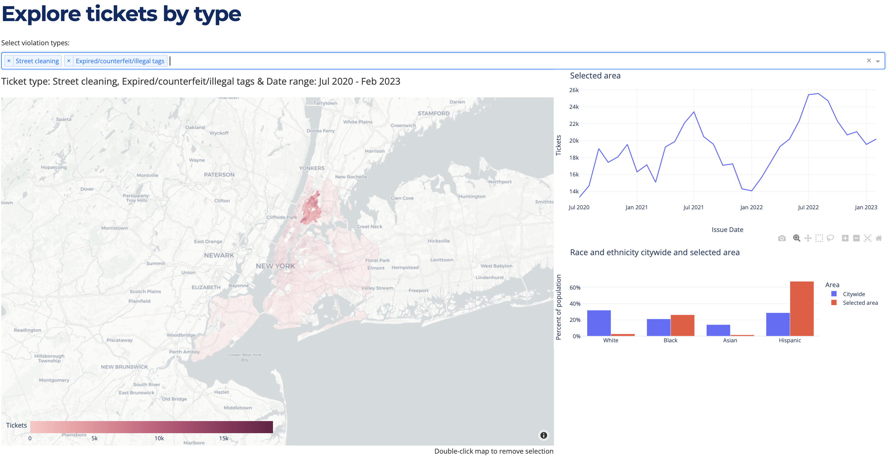
Without a slam-dunk statistical finding, I saw that a better way to share these data would be through a multi-faceted visualization that would allow the City partner who asked for this analysis, and other interested data explorers, to locate what would be most meaningful for them.
I built an interactive map and data dashboard that allows crossfiltering of the data by type, timeline, and geography. Data explorers can select a neighborhood or individual Census Tract, select different types of parking tickets, and see patterns of ticketing over time as well as the comparative demographics of the area.